Let's talk about Responsive Web Design!
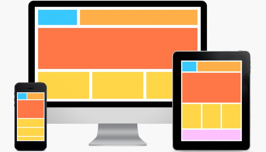
Getting Started
Responsive web design (RWD) is a web design approach aimed at crafting sites to provide an optimal viewing experience, easy reading and navigation. Τhe reasons for using responsive design have a lot to do with mobile devices, but RWD is not just about mobile. It's about being able to access the same great content across ANY device and at the same time allowing for the best user experience. Remember that RWD is not about creating a different version of your website for different devices. It's the same website.
Responsive Design vs. Adaptive Design
Adaptive design is commonly used interchangeably with responsive design, although they are not the same thing. Adaptive design is the concept of defining your where your design breaks down by device and targeting individual devices using media queries in CSS. For example, focusing on Apple devices, you might target the screen resolution for an iMac, an iPad and an iPhone when creating your design. This made sense when there were a limited number of devices and screen resolutions. Now we have devices of all different screen sizes and this makes the task of designing for each one very difficult. This is where responsive web design comes into play.
Key Responsive Web Design Principles
Built on a Fluid Grid
A website built on a fluid grid will be based on percentages instead of on pixels.
Responsive Images & Video
Images should scale depending on the resolution of the screen they are being viewed on.
Media Queries Define Breakpoints
Media queries in CSS are used to alter the layout at various breakpoints in the design.
Non-Essential Content is Removed
At smaller screen sizes none essential content is hidden to remove clutter and improve the user experience. Be careful when deciding what to remove as all of the core content should still be accessible on smaller screens.
Responsive Navigation
While not every website will require responsive navigation techniques, those with extensive menus would benefit from using various techniques designed for smaller screen resolutions.
These are just the basic elements that make up a responsive website. Hopefully they give you a better understanding of what it takes to create a responsive layout.
Some examples of the responsive websites we 've built at ARTIFIEDWEB are:
Saint Andrea Seaside Resort, Mosaiko, Socratis Mavrommatis and Arapinis Jewerly.
