Colors appeal to our subconscious senses and are very important in logo design, inciting us to make decisions. This thing is very important for businesses, because companies want to ensure that people will buy their products. That said, the importance of picking the right color for a logo is HUGE!
![]()
![]()
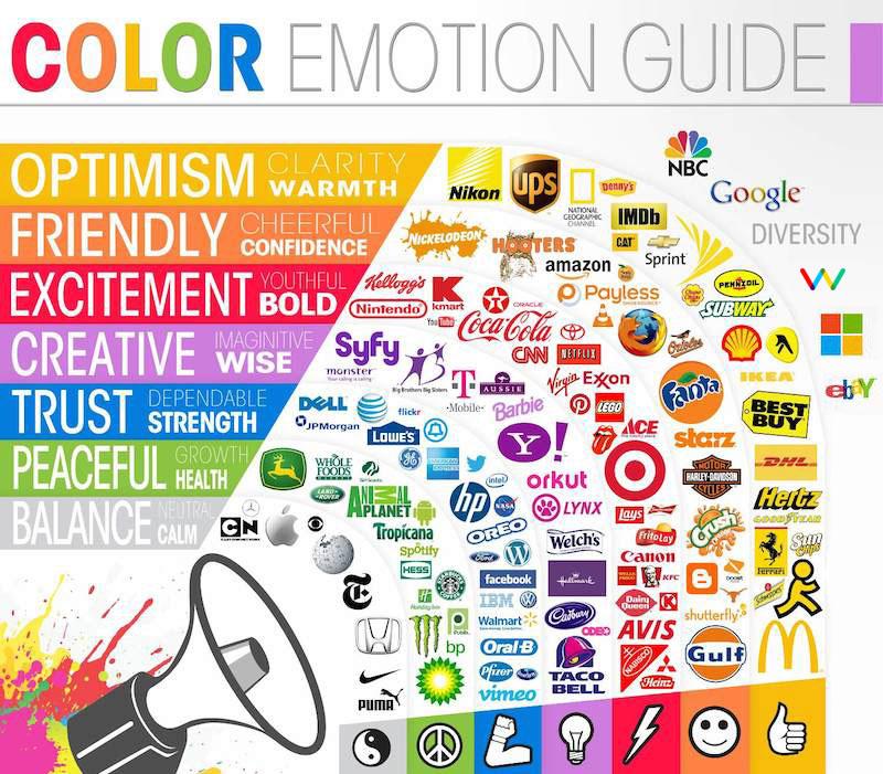
Looking at these logos above, you will notice that a lot of similar companies tend to have logos with similar colors.
Take the pink colors, for example: 41-45. Barbie, Glam Media and Baskin Robbin are fun, playful and often feminine brands.
BP, Sony Ericson, Sprite and Xbox all share green – and all are futuristic. The blues are generally professional companies. Yellows (Best Buy, Hertz, Subway and Yellow Pages) are utilitarian, common-man companies. Using yellow gets people onside.
Oranges are brash and bold – they're cool and youth-oriented. Whereas red is a regal, powerful and professional color.
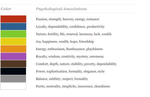
Color psychology is an important thing to consider when designing logos. Think about what the client wants you to aim at. Consider their clients. Then take a look at the spectrums presented above, and think where they'd be best connected.
Images by logomyway.com
